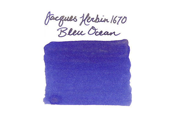
Jacques Herbin 1670 Bleu Ocean: Ink Review
A cool breeze, a sailboat, and sunlight glistening off of ocean waves… Jacques Herbin's 1670 anniversary ink, Bleu Ocean, was inspired by the sea voyages of the company's namesake. It includes the gold sheen that has made Rouge Hematite and Stormy Grey fan favorites. Whether you are off on adventures of your own or sticking closer to home, this bold blue ink with a subtle gold sheen will be sure to help you explore the fathoms of your writing.
Want to be swept away with gold shimmer? This ink pairs spectacularly with a flex or broad nibbed fountain pen. Bring the undercurrents to the surface by giving your bottle a good shake before filling. Rolling the pen in your hands between writing sessions will bring the greatest gleam to your words.
When I first found out that there would be a new 1670 ink, a blue ink, I got so incredibly excited. Blue is by far my favorite ink color, and I do love inks that sheen (can I get a shoutout for Diamine Majestic Blue?). I wanted to find out as much as I could about the ink before I went forming an opinion about it though.. I was told that it was going to be a dark blue, more heavily saturated than the standard J. Herbin line, something between Eclat de Saphir and Bleu Nuit, in a bottle identical to Rouge Hematite but with a blue cap and silver wax seal, and that it would not have a metallic pigment like Rouge Hematite. Okay, so that was a pretty decent description, better than I get for some other inks before they're released. The stock pictures that accompanied were pretty enticing, too. But I didn't want to really get my hopes up until I had the ink in hand. At this point, I know that as many inks I've handled, I am my own best judge for trying to get an idea of how an ink ‘fits' into the ever-growing ink world. Especially since dark blue inks are in no short supply, I wanted to really keep an open mind.
Herbin's marketing stuff states the motivation for the development of Bleu Ocean saying, "It recalls the sea voyages of J. Herbin when he was travelling in the far east and discovered the famous gum which will allow him to manufacture wax." (Herbin was real big into sealing wax at its founding, still is, really).
Now let's talk about the bottle. It's stunning, and really beautifully crafted. I have personally always loved the combination of blue and silver, and the wax on the cap and front of the bottle definitely sets it apart from the other inks on my desk. Most ink companies view bottles as an afterthought, but a few brands like Pilot Iroshizuku, Pelikan Edelstein, and Jacques Herbin's 1670 truly stand out from the crowd. The box that it comes in is beautifully designed.
The only thing that I don't like about this bottle is having to use it. That sounds crazy, but it's honestly just not designed to be used as much as it is to be admired. The bottle itself is a square, which is okay, but the neck is a much smaller diameter than most other ink bottles. The opening is 12.85mm wide (about 1/2″), which is about the same as a Goulet ink sample vial. It'll fit most pens in there okay (Pelikan m800 starts to push the limit), but when the ink level gets down to about half the bottle, you'll have a hard time filling any pen from it because you can't even angle the pen into the corner of the bottle and tilt it like you would need to. So basically, if you want to use this ink a fair amount, you'll need to get an ink syringe to go along with it, or plan to decant it into another more usable bottle.
All of this packaging and design stuff is great, and Jacques Herbin really does this ink right in that respect. But if you're like me, what matters most is what's in the bottle. So without further delay, here is Bleu Ocean:
It's always a little tough to tell the intricate details of an ink from a computer screen, so I'll talk you through my key thoughts on this ink.
- It's a pleasant blue with a slight lean towards purple, darker and more saturated than any of the standard J. Herbin inks
- It does not have a sheen like Rouge Hematite, and shouldn't really be compared to it except in the bottle/packaging
- It flows extremely well, cleans easily, and does not appear to have any of the nib creeping/crusting issues of Rouge Hematite
- It dries faster than most other inks, and reminds me of most of the Pilot Iroshizuku inks in terms of performance and pleasure of use
- Water resistance is not incredible, but writing is still very readable when wet
- The bottle is absolutely beautiful, but one of the least practical ones in the fountain pen world (mainly due to the diameter of the bottle's neck)


