Top 8 Shading Inks, and How to Get the Most Out of Them!
Fountain pens are undeniably cool. But let’s be honest, the real party starts with fountain pen inks! They bring a whole spectrum of fun to the table, offering various exciting properties that can transform your writing experience from mundane to magical. One such property, and my personal favorite, is shading.
What is Shading?
Imagine this: as you write, your stroke starts with a lighter shade and gradually deepens as you lift the pen, leaving a pool of darker, richer color at the end. That’s shading in action! It’s like watching a gradient unfold with every word you write. This magical effect can make your notes, letters, or doodles pop with personality and depth!
Here’s the kicker—shading isn’t just about the ink. It’s a combination of factors working in harmony. For the maximum shading effect, you need the right:
- Ink: Less-saturated inks tend to show more shading.
- Nib Size: Larger nibs lay down more ink, enhancing the shading effect.
- Paper: Less absorbent paper prevents ink from soaking in too quickly, allowing it to pool and shade beautifully.
- Writing Style: Frequent pen lifts create more opportunities for shading to show up.
Now that we’ve got the basics down, let’s jump into my top picks for shading inks.
Pilot Iroshizuku Chiku-Rin

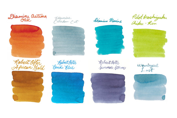
Otherwise known as bamboo forest, Pilot Iroshizuku Chiku-Rin embodies the serene beauty of a lush bamboo grove with its natural, earthy green tones. It’s a versatile choice that balances vibrancy and subtlety, perfect for those who love a touch of nature in their writing.
Diamine Silver Fox
If you’re into grays, Diamine Silver Fox is a gem. It’s a lighter gray, offering a sophisticated touch to your notes. While darker grays might hide shading properties, this one embraces it, making your writing look dynamic and interesting. It’s perfect for those who appreciate subtle elegance.
Robert Oster Honey Bee
This golden treasure is just buzzing with character! Robert Oster Honey Bee brings a warm, rich hue to your paper, reminiscent of a sunny day. Robert Oster’s inks are known for their quality, and this one’s no exception. It’s got that perfect balance of saturation and shading potential.
Diamine Autumn Oak
Here’s an ink that captures the true essence of fall. Diamine Autumn Oak is a natural, rich orange that sits right on the edge of saturation, giving it just enough depth to show off its shading powers.
Sailor Ink Studio 123
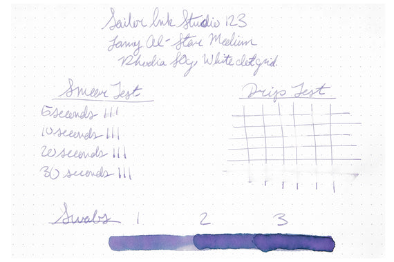
Sailor’s Ink Studio 123 is a masterclass in balance. It pulls together the best aspects of other popular shades like Haha and Nekoyanagi into a harmonious blend. This one’s got a bit of everything, making it a versatile and beautiful choice for shading enthusiasts.
Private Reserve Infinity Turquoise

Light blues, teals, and turquoises are practically born to shade, and Private Reserve’s Infinity Turquoise is no exception. It’s a vibrant, refreshing color that stands out on the page. Plus, it comes with a bonus feature—fast-drying properties that make it perfect for everyday use.
Robert Oster Cherry Blossom
Never would I have guessed that a light pink could win me over, but Robert Oster Cherry Blossom did just that. Robert Oster’s lighter shades are packed with shading fun, and this one brings a delicate, blooming quality to your writing. It’s perfect for those who enjoy softer, pastel tones.
Diamine Celadon Cat
Let’s end on a high note with Diamine Celadon Cat. This community-created ink, born from a collaboration with the fountain pen subreddit, offers a unique twist on the jade color. It’s elusive, hard to pin down, and that’s what makes it so intriguing. Whether you see it as green, blue, or somewhere in between, it’s a delightful addition to any collection.
I used Tomoe River 58g paper, known for its perfect balance between absorbency and smoothness, to truly showcase an ink’s properties. To really see these inks shine, try using broader nibs or pens with flexible tips. Pro tip: remember, the more you lift your pen, the more shading you’ll see! Write on!


